Magazine Survey <- Click link to answer the survey

<- Screen shot of SurveyMonkey survey posted on Twitter
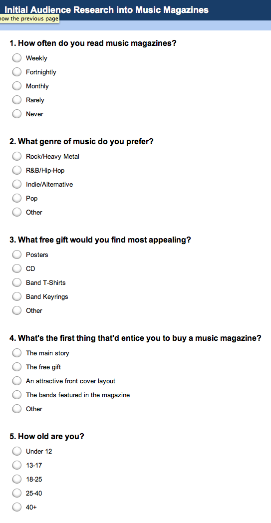
<- Screen shot of survey on the website. For this task we used www.surveymonkey.com to create a survey containing five multiple choice questions concerning music. I chose my questions carefully so they'd be relevant to helping me choose what genre of magazine to create and what to include in it (i.e. free gifts). Once having completed my survey, I then posted the link on Twitter so it'll appear on my followers' timelines and they'll answer the quick questions.


Analysis of Survey Results
Mood Boards
Pop - This mood board is extremely vibrant and mainly consists of pinks and purples, therefore connoting a young female audience. Since a lot of the photographs are of clean-cut, fresh-looking artists, this also indicates youth because the singers look this way so they can relate to their audiences more. Obvious Photoshopping is apparent on a lot of the album covers in order to make the artists look slightly younger, as well as the fashion decisions and poses used. For example, although Justin Bieber is 18, he appears to be dressed fairly young for his age on the front over of Top Of The Pops so that he can be seen as more appealing to the magazine's target audience: 12-15 year old girls. It's a common
 |

Rock - Unlike the previous mood board, the colours shown here are a lot darker, mainly consisting of reds, greys and blacks. This is because the rock genre generally appeals more to males, particularly students and middle-aged rock lovers: a more mature audience than those who like pop. Although the dark colours connote that the genre may be fairly gloomy, they also make it appear to be powerful and domineering, particularly with the use of gothic typefaces as the mastheads. The language used in the mastheads also has a large role to play in this representation: they're normally quick and snappy with words which are to-the-point, thus connoting quite a brisk, gloomy approach because the language isn't overly-friendly. Newer magazines normally use sans serif fonts whereas older ones use serif, which suggests a shift in rock's target audience over the years: sans serif suggests a more modern edge, whereas serif fonts such as Times New Roman look more classical and old-fashioned. A lot of the cover images may be one person being depicted using a direct mode of address.
Rock artists also have a more rugged dress sense than musicians of other genres, because this is the style that many student-aged boys try to imitate: again, rock magazines also photograph the artists featured wearing similar clothes to their target audience so they can identify with them. There are also a lot more male bands/artists here because the genre is most sought after by men, whereas with pop, there are more females because young girls see them as role models. Mid and long shots are common conventions of rock artists' photographs because of the ideology that most of them are in fact bands rather than individual people, and group shots need to be taken far away to show their entire posture, clothing and style.
Rock artists also have a more rugged dress sense than musicians of other genres, because this is the style that many student-aged boys try to imitate: again, rock magazines also photograph the artists featured wearing similar clothes to their target audience so they can identify with them. There are also a lot more male bands/artists here because the genre is most sought after by men, whereas with pop, there are more females because young girls see them as role models. Mid and long shots are common conventions of rock artists' photographs because of the ideology that most of them are in fact bands rather than individual people, and group shots need to be taken far away to show their entire posture, clothing and style.

Dubstep - The colour scheme is also fairly dark for Dubstep (similarly to rock), however a lot more neon colours are used as well as the black. The neon and black theme connotes a student/clubbing-age audience because it's fairly trendy and upbeat, much like the modern clubbing scene. Features such as strobe lighting are used inside the club and neon signs outside, and by using this theme, the magazine is trying to imitate the appearance of acommon night club. Dubstep music is well-known for being played in night clubs and at holiday destinations such as Ibiza: we know this because the front cover of one issue of Mix Mag was photographed on a beach, making it appeal to people of this age group because of the sunny, upbeat theme. The representations shown are mainly bright and energetic to match the personalities of the dubstep fans.
 Hip-Hop - The mood board for hip-hop is generally more varied than the other three (i.e. the magazine colour schemes differ immensely), however there's an obvious dominance of young black males here. Again, much like with the other genres, hip-hop artists are young black males as well as a lot of their target audience. The majority of albums and magazines have a very plain layout with writing in a basic font and a photograph of the artists' face, showing slight maturity, however the genre isn't presented as overly-mature because it's fairly modern. The album covers also reveal the stereotypical elements of rap and hip-hop: men wearing baseball caps and sunglasses alongside their car., this generally showing that mise-en-scene may play a greater role in this genre than some of the others, to highlight its individuality.
https://docs.google.com/file/d/0B_4N6rRq5rEeckNUdzdHWFg3WWs/edit?usp=sharing <- Extensive textual analysis of a music magazine (NME: front cover, contents page and article)
http://goanimate.com/videos/0uZ2t873FgO4/1b <- Goanimate presentation to evaluate my magazine analysis
A4 Article Investigating the Statement "The Major Institutions Rule"
This task has influenced my work because I'm now more aware of the importance of publishing industries as well as the magazines themselves. I've now learnt that synergy plays a large part with some companies, for example Bauer uses the radio to publish its media as well as magazines. This task has been extremely useful because I now have a lot more background knowledge of magazine companies and their sale statistics, and it's also made me decide to use a major institution rather than a minor one to publish my magazine with.
No comments:
Post a Comment