http://www.surveymonkey.com/s/3HPHNDV <- Now I've decided on which genre of magazine I'm doing, I've carried out some further audience research to see what features of a rock magazine the public like most
https://docs.google.com/file/d/0B_4N6rRq5rEeOC1TdmNLS1hUV2c/edit?usp=sharing <- Article for my magazine (text only)
Further research


This question shows that £1.50-£2 is the margin which most people think is acceptable to price a magazine between, and I think this is reasonable for a brand new magazine. NME generally costs something between £2 and £3 because it's well-established and everybody recognises the name, whereas a new magazine will be cheaper to attract more people to buy it: they'll think 'oh it's only £1.50, it won't be the end of the world if I don't like it' because of the reasonable price. However as popularity grows, you can then increase the price because people will know what to expect from it.
 As I discovered from my detailed analysis of NME, red, black and white were the colours most commonly used throughout. Therefore since 79.3% of survey-takers think that this colour scheme is most appropriate for a rock magazine, I'm definitely going to use it. Black and white came in second place with 13.8% of the votes, which is promising because most of the photographs I'm going to use on my main article will be black and white, laid out in a mosaic format.
As seen throughout the issue of NME which I studied, the majority (58.6%) of people would prefer a mixture of typefaces as opposed to having just one. This is probably because as a younger audience, the readers would like more variety and by having a mixture of fonts, the appearance of the article in particular will be more interesting and attention-grabbing. I'll vary the font in my article by having separate styles for the heading, the subheading, the article itself and the pull quotes, as well as a bold byline. I'll also vary the colours of the text used throughout the article, for example the text of the main article will probably be in white whereas the pull quote may be red.
Front Cover Annotation
NME Front Cover Annotation

Electric Front Cover - First Draft

NME Contents Page Annotation

Electric Contents Page - First Draft

Electric Article -First Draft

Which Photographs Will I Be Using?
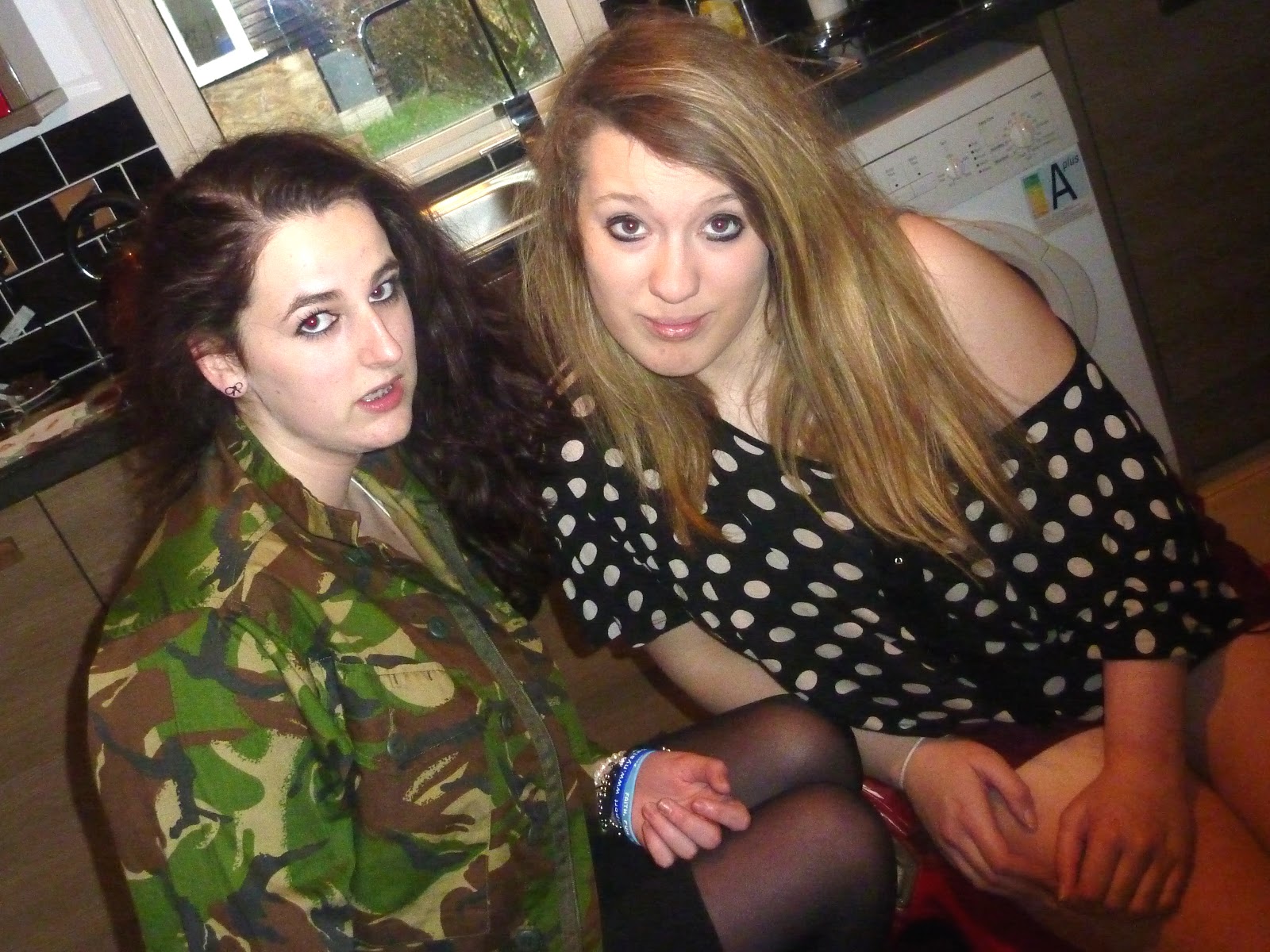
 Front cover: I've decided to use this as my main cover image because the dark backcombed hair and heavy eye make-up represent the rock genre extremely well in my opinion. Although it's a close-up and the majority of rock magazines have two or more people on their front covers because mainly bands are interviewed, I've decided to avert this convention because the main focus of my article is the lead singer of the band Camouflage. This will be highlighted when I write "Kirsty Haines official interview" in bright red writing on my front cover; therefore my cover image is going to be of the lead singer alone because she's more well-known.
Contents Page


 Feature article
Feature article

Article: I'll probably use this photograph as the main image for my article because it's a close-up group picture of all the band members. Although it looks unprofessional because it's a self-taken shot, I'll amend this by cropping the right-hand side so you can't see the arm taking the photo. I'll either place the image above the headline and make it fade towards as it approaches the text, or below the article, right at the bottom of the page. Either way it'll be the only image placed on the left-hand page because it's a clear photo showing us what the band members look like, and the band is the main focus of the article.

This photograph will be another fairly main image but placed on the right-hand page. I think this one is appropriate because of the use of mise-en-scene: the jukebox has proven to be a useful prop because as well as fitting in with the red, black and white colour scheme, it also represents the existence of older rock bands (e.g. Madness). Additionally the title of this article will be "Camouflage in Camden", and since Madness originate from Camden, it'll be nice to include this small link between both of the bands.


No comments:
Post a Comment